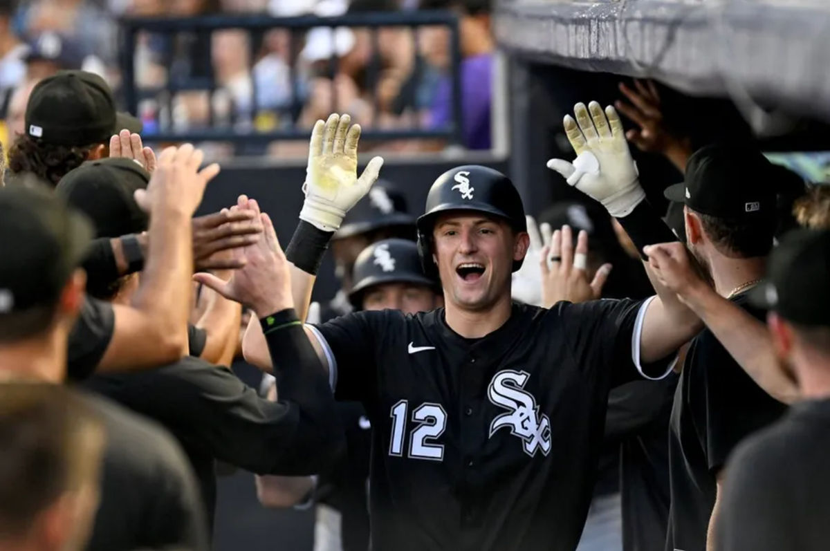
 Jul 23, 2025; St. Petersburg, Florida, USA; Chicago White Sox shortstop Colson Montgomery (12) celebrates after hitting a three run home run in the second inning against the Tampa Bay Rays at George M. Steinbrenner Field. Mandatory Credit: Jonathan Dyer-Imagn Images
 On a random night of watching baseball, I noticed a jersey advertisement that was so terrible it made me think: How bad are the ads on every team’s jerseys?
After going through the uniforms, I broke each team into tiers. If two teams are in the same tier, I generally have them ranked pretty equally, but I did my best to try and order them.
Tier 1: No Advertisement
This tier has two teams, and they don’t have ads—so they’re better than everyone else. Also, both teams have pretty good jerseys on their own, so I ranked them Tampa, then Chicago, but it was close.
Blends Very Well: Matching Colors
Yankees
It pains me to say it, but this is the perfect ad. It’s small, blends perfectly, and doesn’t take away from the classic pinstripes.
Cardinals
Shocker—a great organization like the Cardinals has great ad placement. Small, matches, and blends right into their jerseys.
Mets
The next two jerseys are toss-ups because their ads change colors with their uniforms. I just like how the Mets ad takes up less space than the Marlins ad.
Marlins
Pretty cool blue colors.
Giants
This ad just rocks. If it were smaller, it could easily be number one. I love that Chevy twisted their logo to look good here. One of the cleanest ads in the league.
Dodgers
These next two have the right colors, but I don’t love the ad. This logo is just too bulky.
Tigers
I love that Meijer changed their colors to match, but unfortunately I think the logo looks wildly cheesy. I hate to say that about my favorite grocery store.
Tier 2: The Colors Are Pretty Close
Pirates
This could easily be higher if it had truly matching colors; however, the red Sheetz logo goes with the red from the Pirate bandana, and it just works.
Guardians
Overall, this is the standard for OK jersey ads. It’s kinda big, but it flows really well with the new Guardians jerseys.
Red Sox
Boston and Cleveland were a virtual tie for me, as I feel both teams have logos that just mesh pretty well with their jerseys but aren’t perfect.
Brewers
The Brewers are doing all the right things, but I think the dark blue can be so distracting on most of their jerseys. I do appreciate the smaller logo and mostly matching color scheme though.
Nationals
AARP is such a passable ad. I just think the font on their logo doesn’t blend well with the font on their jersey, but outside of that, it’s a decent ad.
Rangers
These colors aren’t a great match, but I kinda think Energy Transfer has a pretty sick logo, so that does a lot of heavy lifting here.
Angels
FBM has a pretty sweet logo, but green on the Angels logo is some points off. The red framing saves it from being in a lower tier.
Padres
From here on out, I think most of these ads are not great. The Motorola logo takes up so much jersey space. However, it’s not the worst appearance for Motorola on this list.
Phillies
I don’t hate this one. I kinda like the blue in IBX, but it’s still a distracting ad.
Astros
OXY does a pretty good color match, but it’s one of the largest logos in the league, and for that, it comes in at number 19.
Cubs
The Padres did Motorola way better than the Cubs. The giant M ruins a classic uniform.
Rockies
York Space Systems is almost the wrong colors, and it’s quite large, so it gets to be the bottom of Tier 2.
Tier 3: Wrong Color but Not the Worst
Diamondbacks
Avnet’s logo is massive and the wrong colors, but their logo kinda looks like the Diamondbacks logo, so that puts it at the top of Tier 3.
Reds
I think the Kroger logo is pretty clean, but it’s simply the wrong colors.
Twins
Another fine logo, but it’s green. If they had just taken that out, they could easily be top 15.
Orioles
We’ve reached the pretty bad territory. A blue T. Rowe Price logo is just quite ugly.
Mariners
Nintendo has a sweet logo. That’s the only reason it’s not in Tier 4—because if it weren’t a sweet brand, it would be at the bottom.
Tier 4: Nothing Redeeming
Royals
Ah yes, a bright red QuikTrip logo on the blue Royals jersey. Just a putrid ad.
Braves
Unlike the Pirates’ red Sheetz logo, the yellow here does not work. Also, the Quikrete logo just looks so cheap.
Blue Jays
The bright green TD logo is simply the worst logo in the league. It’s massive, the wrong colors, and couldn’t look worse on the Blue Jays jersey, which is normally an awesome uniform.
Tier 5: The A’s
The team with no home is advertising a city that doesn’t want them to move there. John Fisher, you’re the worst—and your lame logo rounds out our jersey rankings.